Thursday, December 16, 2010

Take this test. I dare you!


Check out this test.

This test displays the 19th century research of Ebbinghaus’ - a pioneer in the field of human memory.

The test helps show how you process and remember things through the method of spacing. I personally know that I remember something by being exposed to it at 3 different times vs. just once or consecutively back-to-back.

This test begins being showing you individual words. As each word appears on the screen, you should read it to yourself - warning, this will take a few minutes! You will be asked to do a series of basic arithmetic problems after the last word in the list has been displayed. Once you've completed the arithmetic problems, you will be asked to type out as many of the words from the word list as you can possibly remember.

This concludes the test. A results page will display the percentage of words that you recalled from the list and will explain your memorization status.

How do you memorize things?... Take the test and find out!

* Resource: http://www3.amherst.edu/~mdschulkind/memory/experiment1/Cramminghome.html

Friday, December 10, 2010

Including Tactile Interactions in eLearning

Most professionals in the learning/teaching fields are well aware of the three major types of learning styles: auditory, visual and tactile (or kinesthetic). You are possibly also aware of the many other combinations of learning styles, but we are just going to cover the basic three. If you are in one of these fields, and you are not aware of these learning types, then you must have been one of my teachers growing up...

In all seriousness, it is of great importance to not only have knowledge of these styles of learning, but to consider them in the creation of eLearning courses and any other instructional materials.

My past teaching experiences range from teaching snowboarding, coaching sailing, and training call center agents on various software and sales techniques. As you may be able to tell, some of these are obviously dominant in one or two of the learning styles, but lacking in the third.

Teaching snowboarding had me on the snow for the entire lesson. There was no opportunity for reading, writing, chalk talks, or anything of the sort (aside from the signing of a liability waiver). It was heavily dominated in tactile and auditory. The only option for adding a visual, aside from demonstration, was drawing diagrams in the snow.

Coaching sailing required some sort of chalk talk before going out on the water in order to explain the drills that we would be doing. Once on the water, it was a lot of yelling from my coach boat to all the other boats, hoping they could hear, with most commands communicated using whistles. I also administered a number of written exercises to help with nautical knowledge and racing tactics. It took careful coach-boat maneuvering skills to drive alongside and have a conversation with the sailors.

Training call center agents in a classroom environment is very heavy on the audio and visual, and can very easily be completely lacking in tactile activities; especially when learning about software. The way I brought in the tactile exercises was by creating a mock call center desk, with phone and computer, and had them pretend to be on a call with someone on the other side of a small wall. This not only taught them their sales skills, but enforced their computer skills while on a fake call.

So how do we incorporate tactile learning into eLearning, which is dominated by auditory and visual? This can be accomplished easier than you'd think. Being a kinesthetic learner myself, I create associations with my movements and sequences, and the images and information they are associated with. This can be accomplished using some of the following techniques:

Pop-up Treatments
A pop-up treatment is as simple as a small icon on the screen that is clickable and brings up additional information. By involving the learner in the interaction, the motion they carryout creates an association with the icon they have clicked, the slide from which they clicked, and the data on the pop-up.

Tabbed or Process Interactions
These are interactions created using Articulate, however many other eLearning software has similar interactions, and they can also be custom made (such as a click-and-stick). They requires the user to click on something to learn about each piece of information. They associate the information with the clicking, and are able to remember the sequence of steps.

Notes
Many eLearning viewers include a section for the student to take notes. Even though this seems very much like reading and writing, the action of taking notes assists the student to identify key information from the audio, and transfer that information using their own hands and words. If it weren't for the act of note taking in college, I wouldn't have retained anything in those dry lectures. Amazing how the large world of academia has so much to learn itself...

Scenario Based Courses
Instead of designing interactions based on the course, design the course based on an interaction. The course can be set up as a scenario. The learner is given background information, then based on that information they are required to make a choice. Based on that choice, they are brought to a screen that tells them if they are correct, and why, or to a screen that tells them it was not the best choice, and the reasons.

Simulation Courses
These are set-up similar to a "choose-your-own-adventure" storyline. The course provides a chunk of information, then they offer the learner a choice. Based on that choice, the course branches in a certain direction until it offers another choice, and so on. This can get very involved and in depth, but the benefits of covering all three major learning styles is obvious. The learner can associate certain actions and decisions with their coinciding consequences or benefits.

These interactions and courses take more work, planning, and often more content. It is important to reinforce the audio content in eLearning courses with the visual (as we already do), but also with the tactile, which we need to do more. Try some of these techniques in your next course, and always be thinking of more ways to physically involve the learner.

Friday, December 3, 2010

eLearn to Drive Defensively

Just recently, I decided that I wanted to take a defensive driving course—under the guise that I would be bettering myself, when in reality, I just wanted a decrease in license points and a reduction in my insurance rate. After this essential decision was made, I next had to choose how I would take the course—in a classroom or online.

Courses on driving defensively have historically been given in the classroom setting, requiring students to sit through 5 hours of having automotive information tossed their way. Though I have not personally taken one of these types of courses, my imagination runs rampant on the types of things that could be going through these students’ minds during the class time—“has it really only been 20 minutes,” “when is the next break,” “I wonder if I need reservations for P.F. Changs to eat there tonight,” and my favorite one that happens to me all the time, “aw, man, my foot fell asleep again”.

With these conjured thoughts in mind, I eagerly opted for the online course. As far as I’m concerned, anything that is elearning has to be more exciting.

After spending 6 hours taking this course online—it’s 6 hours for the online course versus 5 hours for the in-class course—I realized that maybe I made my decision too hastily. I certainly learned a lot about automotive rules and regulations, which is obviously the main point of taking the course, but I now know that not all elearning is engaging.

For this particular course, there was definitely room for improvement, but to be fair, there’s always room for improvement with any elearning course as far as I’m concerned. Certain factors that I tend to take for granted like audio, graphically pleasing icons, exciting animations adding some motion to the screen, appropriate chunking of topics within a module or lesson, and so forth—I was really missing all of these components by the time I completed the last topic, topic 30, of the first of 4 modules. With approximately 5 hours of course remaining, I came to the conclusion that I may end up falling asleep at the elearning wheel at some point. So much for my theory that all elearning is engaging.

Monday, November 8, 2010

Hyperlink Hijinks

Those of us who develop our courses with the Microsoft PowerPoint/Articulate Suite combo are familiar with a host of buggy little problems. Don’t get me wrong…I like the programs just fine, and, ultimately, I feel they get the job done pretty well…but sometimes it’s a frustrating ride.

I recently had a course in which I had to create a number of hyperlinks, leading from particular slides to corresponding PDF documents. Having accomplished this task once before, I thought I knew how to do it. However, once I’d published this course…all of the links were broken.

After stubbornly trying a number of tactics that I’ll loosely call “fixes,” I finally conceded failure. Once I climbed in off the ledge, I contacted a colleague who straightened it out for me. I thought that her advice would be worth sharing.

Step 1: Prepare the PDF file you plan to hyperlink by removing capital letters, and spaces from between words, in the file’s title. If this step is overlooked, the links will not function once the course is published. For example “Meditations on a Crimson Shadow.pdf” would need to be represented as “meditationsonacrimsonshadow.pfd”.

Step 2: Upload the PDF document to the “Attachments” area of the PowerPoint (located on the “Articulate” menu-tab).

Step 3: Highlight the text or object to which you will hyperlink the document and click “Hyperlink” (located on the “Insert” menu-tab).

Step 4: Browse for the appropriate PDF title from your files and select it.

Step 5: Entirely remove the displayed pathway, EXCEPT for the pdf title (e.g., “meditationsonacrimsonshadow.pfd”) and save.

Step 6: Publish.

Step 7: Open the published file’s root folder, open the “data” folder, and open the “downloads” folder. Copy the appropriate PDF file and past it into the published root file. This is a critical step. If the appropriate PDF file is not copied into the published course root folder, it will not open when the link is clicked.

Admittedly, this process may not be only one which will establish functioning hyperlinks within an Articulate course—and, maybe it’s not even the best one. However it is simple, fast, and (best of all) it works! And it never hurts to find a way to make the PowerPoint/Articulate development process a little less frustrating.

resonate!


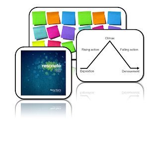
I recently read Nancy Duarte's latest book, "resonate."

res·o·nate can be defined as:
v. res·o·nat·ed, res·o·nat·ing, res·o·nates
v.intr.
1. To exhibit or produce resonance or resonant effects.
2. To evoke a feeling of shared emotion or belief: "It is a demonology [that] seems to resonate among secular and religious voters alike" (Tamar Jacoby).
3. To correspond closely or harmoniously: "Symbolism matters, especially if the symbols resonate with the larger message" (William Greider).

Just as its actual definition, the book "resonate" aims to evoke a feeling of shared emotion and belief. In its context, resonating can make your presentation's main ideas stick with the audience you're catering to. You want your audience to walk away from your presentation remembering the themes and ideals you had taught them during your presentation. The book "resonate" helps in accomplishing this by providing you with the tools to make more attractive and better planned and created presentations.

The main two take-aways (among many) I had in reading this book include: to 1. Tell Stories, and 2. Use sticky notes (seriously!).

Tell Stories! Use story telling to convey your information to your audience in a creative way. Culturally, most of us remember things through stories, so why not take dry information and turn it into an engaging story that will resonate with your audience. Nancy discusses the utilization of a hero's journey in writing a presentation - in writing a story. The rise and fall and rise of a hero is a universal concept that is accepted by most audiences and would work well for mainly any presentation (Read chapter 2 of "resonate" to learn more about this).

Sticky Notes!
In her book, Nancy discusses the magic of using sticky notes. Think about it. You can pretty much do anything with a sticky note. I've always had loads of them around (and yes, admittedly, have been a sticky note fiend). You can write individual ideas on a sticky note. With several sticky notes of ideas, all you have to do is move them around and arrange them as you best see fit. Now you're building a story with your ideas. Brilliant!

How cool is all of this stuff for presentations? Now think about how cool it can be for elearning! Incorporating stories and better storyboarding into your elearning courses and development processes can only make your elearning better. Just as with lectures and presentations, taking these values to the elearning platform will also cause the resonate affect with you audience.

So, get to it. Use those sticky notes and go tell some stories!

You can buy "resonate" at amazon.com and follow Nancy's Blog here.

Friday, October 22, 2010

Stop, Collaborate, and Listen

I would offer a gold star to the first person to place my post title in its respective pop song of yesteryear, but I think it’s too easy.

What this is really about is the opportunity to collaborate at the outset of or during storyboard development. As I came on board to my new project management role in June and started in on refreshing and older course as part of my training, I learned that the step of taking time to collaborate with another instructional designer (ID) or your project manager (PM) (or, gasp, both??) tends to fall away as expectations for output increase.

This is a very common shortcut in this learning space. In my last position, a step on the Project template that was always skipped was graphic design collaboration. The ID was expected to put comments in on concepts he or she had specific visions for, or on those concepts that may be tricky to animate, but otherwise the off-shore designer was expected to forge ahead and animate sans input or collaboration. Depending on the designer’s skill and experience, this either went smoothly or it went, well, bumpily. On the bumpy road, the ID would end up collaborating with the designer via logging edits in a review system. While working in different time zones, we’d go through a few iterations of: log edits, wait, implement edits, wait, review changes, log more edits, wait, implement new edits, wait… You get the picture or have been there, done that!

So, what’s better about a process where development and design are handled by one role? You as the ID own the entire process. Not only do you have input into the content at authoring, but you then transition into developing your own storyboard, and then into implementing said storyboard at media development. Those concepts you thought would be easy to animate because the images and animations were percolating while in content development will be easy to develop. No mind-meld needs to take place between you and a graphic designer. Those concepts that you thought would be a little challenging to animate probably will be, but your little brain hamster has been spinning his or her wheel on that problem while you’re working on other things. You’re more ahead of the game than any graphic designer might be in coming up with a slick treatment for a vague or slippery concept because you’ve had time to ruminate.

“But Christy!” you interject, “Are you advocating for always storyboarding in a vacuum and never reaching out for collaborative help?” Absolutely not! Having storyboarded (eww, that word hurts my editorial self) my first few screens of my refresh course with an ID to get the feel for amount of icons and action on the screen was invaluable. I’d read the content several times, but she brought something new and fresh in several cases that enlivened my ideas. Similarly, while at a developer’s round-table a few weeks ago, in an effort to instill in newer developers a feel for how much and how often to change icons up and fade them in and out, we storyboarded one screen together from a final lesson in my refresh course. Again, even though I had a general idea of what I wanted on that short screen, the other six voices around the table brought something fresh and the end result is a lovely little screen. Would my animation as I’d originally envisioned it have worked? Sure! But the collaborated animation is a bit more…elevated.

Here’s where the rubber meets the road, though. We can’t always take the time to collaborate on every screen. You have to rely on your skills, strengths, and exposure to the Subject Matter Expert’s good ideas during development to get you rolling in the right direction. There will be trouble screens or concepts, and that’s the perfect time to reach out. Ping a fellow ID or your PM and sharing your screen to hammer out those challenging pieces. Meet for a couple hours at the outset of storyboarding and get the creative, brain-storming juices flowing. Hand off your storyboard after a lesson has been annotated and get some input before forging ahead. Having collaborated on a few screens and not on others, and having handed off my lesson 1 storyboard for input before moving on to later lessons, I can see how both approaches helped me refine my ideas and improve some of my vacuum-made decisions. Everything in moderation—you, the ID, are the best judge of when you need to reach out, and when you’ve got a given animation in the bag.

And here’s my parting thought: on a few screens of my lesson 1 storyboard, I got storyboarding fatigue. I thought, “I know where I’m headed on this concept. I’ll not waste time noting my ideas in the storyboard…I’ll just animate out of my head.” Well, hello rookie of the year! Guess what? If you take the time to develop a detailed storyboard, even if you do it in a vacuum, when you move ahead to media development a couple days later, it’s as if you’re collaborating with yourself. You reject certain ideas and bring in others when you have time and space between your initial thought for an animation and your implementation of that animation. If you’re not going to take the time to collaborate at the outset of a course build or mid-stream, at the very least you must stop, collaborate, and listen to your storyboard when moving on to media development.

Friday, October 1, 2010

Horray for Project Management!

Why is project management so important, or better yet, helpful? Well, I believe that it brings a certain amount of structure and process to any project. Having structure and goals allows you to break a large project down into smaller, more manageable pieces. In my own experience, I’ve accepted projects and immediately afterwards felt a sense of dread or fear come over me, when looking at everything that needs to be accomplished. In order to curb those overwhelming feelings, I keep a few tips in mind to help cope or eliminate those feelings, and allow you to deliver a quality product, on time!


Tip 1: “Under Promise, Over Deliver”.
In my own experiences, I’ve been consistently more successful when I am realistic with my estimated timelines. Typically, when asked that dreaded question: “How much time do you need to complete this?” If you estimate how much time it will take to complete each task and add a little cushion time on for incidentals, you should be able to deliver the quality product, maybe even early if you have no hiccups. If hiccups do arise, you have extra time built in to deal with those and stay on track.

Tip 2: “Be Realistic/Honest”
I find that when I am realistic about what I can complete and the time it’s going to take me, it’s easy to meet any deadline. It’s when we agree to complete something when we know full well, or suspect that we will never make that requirement, that we do not succeed.

Tip 3: “Re-chunk the Deliverables”
So you’ve been assigned a project that has an end date and that’s it. No other deliverables and it’s a new process that they want you to create yourself. That overwhelming feeling is sinking in. Well this is a great opportunity to break up the project into smaller pieces. Start by identifying the tasks that you need to complete. Even if they are out of order…just jot them all down and organize them once you realize you’ve identified all the tasks necessary to complete the project. Then look at each task and complete it one at a time. It’s much more manageable and less intimidating than looking at the whole big picture!

Tip 4: “Create Personal Goals/Deadlines”
Typically when given a project you are given the final deliverable deadline, and maybe some milestones in between. I take these dates and place them on my calendar. Then I work backwards from those dates and set personal goals for each deliverable. My personal goals/deadlines are typically 1 day before the actual deadline. This gives me again that built in cushion in case you have unforeseen issues arise. Additionally, if you mark it on your calendar, you are reminded what your dates are, and the deliverable isn’t as easily forgotten.

Tip 5: “Roadblock? Ask for HELP!”
So many times when we are working on a project we hit a roadblock. Something happens that you just can’t fix or you’ve tried everything you can possibly think of and nothing’s changing. My advice is: Don’t wait too long! Just asking someone for a suggestion might shed light on that missing piece that you need to overcome the roadblock and keep progressing. Don’t spend more than a few hours troubleshooting.

Monday, September 27, 2010

RE: Rage Against the Machines


Oh, dear Mr. McCoy, I've always thought the machines would one day take over myself.

This begs the question, was Pearl Jam correct with their interpretation of "Do the Evolution" or will we all one day morph into giant beetles stuck on our backs as in Kafka's Metamorphosis?

I try not to think about it, but with today's technology it's hard not to feel that we're headed toward that direction. Whenever technology fights back at you, you just have to roll with the punches-take a few steps back, fix the problem, take in a big breath of air, sigh, and move on.

Saturday, September 25, 2010

Rage Against the Machines

It’s a well known and uncontested fact that Machines will, at some point in the future of our planet, subvert human civilization to enslave Man and establish a global dystopia of epic proportions.

Having been planning this coup for decades, perhaps even a century, the Machines have already begun their insidious campaign of demoralization—harassing us constantly, to soften us for conquest.

It seems that the Machines have launched their insurrection by corrupting one of Man’s most loyal servants—the computer. What better vehicle for betrayal? Not only are computers present in virtually (no pun intended) every household and business, but we’ve ceded CONTROL of our most vulnerable and sensitive defense and civic systems.

OK, you want evidence. As professionals in the field of instructional design, many of us use Microsoft PowerPoint and the Articulate suite. Programs such as these are primary weapons of the Machines, which they use to wreak havoc on our emotions. For example, many of us are regularly reduced to jabbering bundles of incoherent frustration because of a message like this:

“PowerPoint experienced a serious problem with the ‘articulate presenter ribbon’ add-in. If you have seen this message multiple times, you should disable this add-in and check to see if an update is available. Do you want to disable this add-in?”

Or, what about when you publish and launch a course, and the player just FREEZES at a particular point on a particular slide? There’s no valid reason for it. Everything checks-out.

You guessed it—the Machines.

Once I spent two days synchronizing audio files to individual slides. When I got up on the third morning, much to my chagrin, there were NO audio files in the PowerPoint presentation at all! Back to square one—and that makes for a really pleasant phone call to the boss.

The Machines got me again.

The absolute worse assault I’ve had to withstand was opening a PowerPoint file I’d been animating (and saving) for days…only to find it an empty template.

I’m still chewing on that one.

How can I prevent what I don’t understand? Vanishing hyperlinks; Articulate interactions which “cannot be found”; images that remain visible on the slide regardless of being programmed to “fade out”…each one its own special variety of aggravation.

In the end, I guess the only thing we can do is attempt to implement the solutions offered by the brilliant denizens of the message boards—who are usually more adept than Technical Support staff. ("Uh…did you try rebooting?")

Let’s face it, if you develop with the PowerPoint/Articulate combo, and you had a nickel for every time you’ve experienced one of these issues…you’d be sipping mimosas and nibbling caviar on the Riviera. But, if you’re like me, you don’t have all of those nickels…so fight on, Resistance Designers! FIGHT ON!

Friday, September 10, 2010

Thirds Don't Always Come After Seconds: The Rule of Thirds


Just recently, I was introduced to the Rule of Thirds, specifically for the creation of an eLearning course using PowerPoint slides. Basically, it is the theory that involves dividing your slide, vertically and horizontally, into thirds, like what is shown in the graphic to the right. Then, once you have completed this task, the rule recommends the placement of key graphical elements at intersections of these imaginary thirds lines, along the thirds horizontal lines, along the thirds vertical lines, and at specific power points.

After looking at the examples provided at the following website, I could definitely see the advantages in using this method for slide development: http://sixminutes.dlugan.com/rule-of-thirds-powerpoint/. But, this also raises a specific question: What if my slide template includes a title section that appears along the top of every slide? Does this mean that I still use the same Rule of Thirds theory, or is it something that should be modified based on my slide template specifications? My thinking is that the Rule of Thirds would be applied to the slide real estate I’m actually using to run my animations, not to the entire slide itself, which means my Thirds divisions would differ from the basic rule of thumb.

Monday, August 30, 2010

Designing for the Internet Literate and Illiterate

Nowadays we may find ourselves throwing terms like "web 2.0" around like our parents used to use "telephone". The older generations are slowly catching up, but just because they are on Facebook, doesn't mean they know how to use it.

As Instructional Design and eLearning evolve, they are becoming more and more reminiscent of the users general experience on a normal website like Facebook, Twitter, Flickr, and other popular networking-type sites. The trend is more visual, with less instructions. The menus, frames, "click here" text, and buttons of yesteryear are replaced by images, graphics, and interactive visual elements.

The purpose is to create something that has design and functionality, based on how the user would intuitively seek information. Many websites now just have a graphic, and by moving your mouse to different parts, options and links are revealed.

The problem is that what is "intuitive" for some, is not for others. More specifically, the internet illiterate. Almost everyone is computer literate these days, it is required for nearly any job indoors. Internet literacy, however, is a completely different animal.

We are constantly striving to increase learning and retention. Visuals help us reinforce learning, but they can also distract. In many cases, we try to keep it simple, which is why design (website, and elearning) has moved away from too much on-screen text. However, if we do away with it completely, we are leaving a chunk of our audience high and dry. The simplicity can actually cause a distraction, as it leaves the learner desperately seeking what we assumed they would find intuitively, taking their attention away from the content.

Because the eLearning audience is likely to consist of numerous demographic groups, it is important to find the balance between intuition and instruction. Too many words on the screen can distract, too few can confuse. Find graphics that represent what you're explaining, and then pair it with simple text that is consistent throughout the course, such as "click for more information" or even just "click". Inconsistent text throughout the course will have your audience taking double takes to be sure they read it correctly.

You can view internet illiterate people and internet literate people like two versions of the same hardware. The illiterate users are the original version, and the literate users are a new, updated version. As you continue to create software, you always have to be sure it's not just compatible with the new hardware, but that it's backwards compatible with the old hardware too.

Monday, August 23, 2010

Articulate Snagaroo?!: Codejock.CommandBars.v11.2.1.ocx


So, I recently went to publish an course in MS PowerPoint via Articulate Presenter. To my dismay I received an error message! Error message "Codejock.CommandBars.v11.2.1.ocx", what's that?!? In my frustration I Googled the error. Apparently it's a known Articulate problem.


To rectify the problem I tried doing the following:


If you receive an error message while using Presenter ’09 that Codejock.CommandBars.v11.2.1.ocx is missing one of its dependencies or is not correctly registered here’s what you should do:


See if the file exists here C:\Windows\System32\Codejock.CommandBars.v11.2.1.ocx.


If the file exists:

  1. Download register_codejock.zip.
  2. Unzip the file.
  3. In Windows Vista, right click the file register_codejock.bat and select Run as Administrator. In Windows XP, double click the file register_codejock.bat.
  4. You should receive a message stating that the file registered successfully.
  5. Launch PowerPoint and try to duplicate your issue.

That didn't work, so I did the following:

  1. Uninstall Presenter ’09 via Start -> Control Panel -> Programs (Vista) or Add or Remove Programs (XP or earlier).
  2. Download and reinstall the latest version here.
  3. Restart your computer.
  4. Launch Presenter ’09 and see if you can duplicate your issue.
  5. If you can check to see if the file exists and then repeat the steps above for If file exists.

Success! After my reboot, Articulate and MS PowerPoint behaved once more.


*Reference: http://www.articulate.com/support/presenter09/kb/?p=432

Thursday, July 29, 2010

Once Upon a Time, There was an eLearning Course

When developing an online course, there are so many factors that are involved—most of which seem to be focused primarily around the content itself. Yes, I agree that a course’s content is vital to the delivery of quality eLearning, but I also think that how the content is presented visually is just as important. Simply placing an icon in a specific location on the screen, giving that icon a particular “action,” and so forth can really bring a course’s content to life—actually tell a story.

To better prove my point, I have put together a few basic videos for you to see what a difference the placement of icons and simple animations can make in strengthening the overall concept that you may be trying to get across to the learner. In this first video, I am attempting to visually show the sentence “The quick brown fox jumps over the lazy dog to steal the dog’s bone.”


As you can see, the icons are placed in a single row. The icons definitely match up with the general order of the sentence, but do you feel that the way these icons are being presented really provides the full concept? No, I agree, I think it needs a little more added to it, to really get the sentence’s concept across. Now let’s take a look at the next video, which is also attempting to visually show the same sentence.


Now, the icons appear one at a time, in a single row. The simple animation of fading each icon onto the screen, one at a time, helps to build a “story” around the sentence, but do you think it still needs more? I think so, too. How about this third video?


Do you see a difference? This third video shows how, through the appropriate placement of icons and some simple animations, you can really tell a story with your content.

Friday, July 23, 2010

Creating a Mathematically Intensive Course Without Sacrificing Aesthetics

I have been working on a course lately with a lot of terms and mathematical equations that need to be viewed on the screen. I have found a few treatments that prevent the bland math-y look and create images and graphics that match the visual style used in the rest of the course.

A very useful treatment that I have been using on my current course is "word art". Word art is somewhat lame, but when it comes to showing mathematical equations, or X's and Y's, it's a relief. Most programs have some type of word art, even if it is named something different.

I created the equation, then added the word art treatment, and saved it as a picture (if you don't save it as a picture, it may turn out jumbled). I used the most basic treatment, which has a fill and an outline. By changing the color of parts of the equation, and layering them on top of each other, I'm able to create a highlight effect without using shapes, annotations, or animation. Additionally, when you need just a section of an equation, you can add the image, and crop the sections you don't need.
Using this treatment has added dimension to what would otherwise be a very dry text-on-screen equation. And though it is a simple solution, its benefits are a more eye catching experience with a look that matches with the theme of the other treatments used throughout the course.

In addition to equations, creating real mathematical graphs can be a challenge using excel, but it is possible. You can manipulate the axises to look more like algebra, and less like finance.

You can adjust the axis settings to have the horizontal axis meet the vertical axis at the zero, and then by creating negative values, it will extend your graph to look like linear algebra. You then need to adjust your vertical axis to meet your horizontal axis at whatever value is at the center. You will want to use an odd number of "categories" to achieve this result.

By deleting the default "series" labels and replacing them with numbers, and having the label appear on the tick mark instead of between, you create the linear graph effect easily.

You can use this treatment throughout any mathematical course to illustrate your graphs, and continue to keep within theme and approved colors by creating a border and adjusting the color gradient.

You can also keep with the normal quarter graph look to illustrate other ideas, such as the bottom two graphs I created to illustrate "outliers" and "variance". I removed all axis labels, as they did not reinforce the concept.

Using these graphs allows you to control the background and other effects without having to use shapes, which are unstable, can easily appear messy and uneven, and can be time consuming to create.

Friday, July 2, 2010

Little Things Mean a Lot...of Aggravation

It’s usually it is the little things that will drive one to brink of madness. By their very nature, though, little things are…little. That makes them a bit less threatening than a giant SNAFU…but infinitely harder to find. For example, I recently had a little problem with an Articulate interaction I created to add some zazz to the course I was animating.

The interaction seemed to come together pretty well. The settings, color scheme, fonts, tabs, controls, and whatnot were all aligned with my organization’s specifications. A little slice of heaven.

Much to my chagrin, when I previewed the interaction, I discovered that the audio file would begin to play when it should…and then start over for a second time at about 5 seconds in. Basically, it sounded like a slightly delayed echo from the bottom of a garbage can.

Naturally, I was a little irritated because I’d have to redo the audio. So, I opened the interaction file once more and re-installed the audio file. I saved and republished the interaction—same problem.

Hmmmm…OK, now it was ratcheting up my frustration level. I mean, I’ve created HOW many of these in the past? What was the problem? One more time…

After repeating the process again, and finding the same echoing double-audio, I tried the program’s “Help” option. The information in “Help” rarely holds any answers for me, and this time was no different. So, I started looking for answers online. I tried a few message boards, including the Articulate site’s posting areas. I found nothing.

I’m guessing that, at this point, you as the reader are getting as frustrated with me as I was with Articulate…so I’ll cut the chase!

I finally found an obscure post on a site that had little to do with Articulate or e-learning. I had wasted time, effort, and my last iota of self control—but I had finally found an answer I hadn’t read before. It said that the problem of double-audio in an interaction could be the result of having punctuation symbols in the file's save-name. What? This solution seemed SO disconnected from the actual problem, and everything else I’d read or experienced, that I assumed it was a sham.

Since it was such a simple little fix I thought I’d give it a try. I found the Articulate interaction file in the course material, and I removed the em-dash from the save-name…and I’ll be darned if it didn’t work like a charm! That was it! All that messing around, swearing, stomping to-and-fro like a toddler in a poo poo diaper…just one TINY edit to the file name and my problem was solved.

I know…bizarre.

At any rate, the point of this wandering little reverie is that sometimes, when things aren’t working out, it’s just a little tweak that makes a big difference. Next time I have a little issue with a job, I plan to take a little break, do a little research, and maybe save the last little sliver of my mind…

Thursday, June 17, 2010

eLearning and Conquering the Universe at the Same Time


In a world of ever-changing technology, where a brand-new laptop purchased yesterday is considered practically obsolete by the end of the week, it seems like the younger generation is really able to take it all in stride. They’re little sponges, soaking up everything around them, especially when it comes to anything in the media arena. From watching TV shows like Sesame Street to playing with toys like the LeapFrog apparatus, to playing online games on the computer, they are constantly learning without even realizing it.

When taking this all into consideration, a question pops into my head, “Why does it seem like they’re not learning as quickly and easily in school?” How is it possible that my stepson can rattle off every piece of mad loot he wants to get from his online game—knowing exactly where the loot drops, what stats it will provide his character, and so forth—but yet my questions about what he learned in school that day are met with a blank stare?

A possible answer to this question—can eLearning save the day here, so that a young mind can be educated while conquering the universe at the same time? It’s definitely something to think about. Put simply, is there a way to apply the engaging beliefs that are eLearning and provide this type of training/learning to all ages? Also, is there a way to do this without changing future schooling expectations—the next generation expecting this type of learning to be used throughout their entire school career, from elementary school to graduate school, as the only way to learn?

Maybe the best solution is a blended solution, where there is a little bit of everything to keep it exciting. As opposed to just using a computer as a word processor or as a reward for completing an in-class assignment faster than anyone else, how about using them for eLearning purposes with a twist. Can you imagine an MMORPG used in school that teaches vocabulary, math skills, and global studies all at the same time? For example, envision the learner’s character questing for mad loots, learning new terms along the way, completing math problems and puzzles to successfully complete a quest to get their mad loot, all while traveling around the Earth from country to country learning about culture, history, and so on. I’m sure there are resources available that do something similar to this, but are they subtle enough to “trick” the younger generation into saying “Wow, this is fun” instead of “Ugh, more school.” I think this type of eLearning, added on to the wonderful talent of a school’s administration and staff, would be a great way to renew the desire to learn.

Friday, June 11, 2010

What is HTML 5

In my experience as an eLearning developer, Flash has been the primary development and delivery platform for nearly all motion graphics. In the last few months there has been a lot of discussion over the impending takeover of HTML 5, and how it will impact Flash. Since I wasn't terribly familiar with the features and technology behind HTML 5, I went in search of something to bring me up to speed.

The below infographic was created by the business and technology experts at FOCUS. I found this to be a fantastic resource in understanding the basics of HTML 5. If you already have some familiarity on the subject, the chart also serves as a great browser/feature compatibility guide.

click to enlarge

Scenario Course Tips and Tricks

As the demand for Scenario Based courses increases, we are starting to find more effective and efficient techniques for using our current templates.

After completing my first scenario based course, I have found a few helpful shortcuts that make life a little easier.

When creating a normal course, filling in the lesson name and topic title automatically transfers to the "slide properties" on the articulate tab. When creating a scenario course, all of those text fields on the slides are not needed and therefore deleted, which then also carries onto slide properties (replaces the title with "Slide #"). This requires the designer to manually fill in the slide titles in the slide properties window.

To prevent this long and tedious step, instead of deleting those text fields, just move them up above the slide so they are not visible. This will allow the slide properties to continue to pull the title information, preventing the need for manual entry.

Another trick I have used is for text that appears to have been written on a white board or a notepad. The first thing I did was Google "handwriting fonts", and found one that I liked (I have posted this font on the content wiki). Our standard for animations in a regular course is to fade in/out, very fast. With a scenario course, there is much more leeway with animation options. For text written, I chose to wipe, from left, either fast, or very fast. This gives the appearance the text is being written onto the white board. There were a few instances I had arrows drawn on the whiteboard as well, and would use the wipe entry going in the direction of the arrow (down, up, left, right, and it works for diagonal too).

In addition to the above text trick, it is also important that each line of text have it's own text box, and the animation can either occur after previous, or on click. That way each line appears to write after the one before it, instead of all lines wiping from the left at the same time.

Another very important step is to create your cast of characters. Before you start building your people, make sure you read the transcript, and create a cast list. From there, create each character ahead of time so you can have them ready to insert into your course at the appropriate time. This will keep you consistent from the start.

The last tip I want to discuss today is using the background image. When I first began, I used the office backgrounds like another object on the slide, but I quickly realized that it is much easier to right click the slide to format the background fill, and select that picture from file. This will prevent any issues resizing, or having to constantly "send to back". You can also "Apply to all", preventing you from having to do that to each slide. You can customize certain slides as you go.

Despite the seemingly extra work that is required in a scenario based course, I prefer them over the conventional template. There is much more leeway, allowing the designer to be more creative, and use a variety of animations and tools to keep the audience engaged.